Same Products, Totally Different Feelings: What Separates a Curated Store From a Digital Dumpster Fire
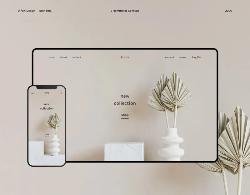
Photo: clean minimalist online shopping website design aesthetic, via i.pinimg.com
Let's say you're hunting for a new set of kitchen knives. You open two different browser tabs. Both stores carry the same brands, similar price points, and nearly identical return policies. But one of them makes you feel like you've walked into a Williams Sonoma, and the other feels like someone digitized a yard sale and called it a website.
You close the second tab without buying anything. You didn't even fully process why.
This happens constantly in online shopping, and it's not random. There's a whole invisible architecture behind why some e-commerce platforms feel intentional and others feel like they were assembled by someone who'd had one too many energy drinks. Understanding that architecture? It's actually kind of fascinating.
The Brain Is Always Doing Math You Didn't Ask It To Do
Here's the thing about how humans process digital environments: your brain is constantly running what psychologists call "cognitive load" calculations. Basically, it's measuring how much mental effort it takes to make sense of what you're looking at. A cluttered, inconsistent store forces your brain to work overtime just to extract basic information — what is this place? What do they sell? Can I trust them?
A well-designed store reduces that friction to almost nothing. You land on the page, and within a few seconds, you just get it. The categories make sense. The imagery feels cohesive. The language sounds like it was written by someone who actually cares.
Lower cognitive load = higher trust = more time spent browsing. It's that simple, and also that complex.
White Space Isn't Empty — It's Doing Serious Work
One of the most underrated elements separating a curated store from a chaotic one is white space — or the deliberate absence of stuff. Amateur storefronts tend to cram every pixel with product images, promotional banners, countdown timers, and pop-ups that appear before you've even scrolled once.
Stores that feel premium? They breathe. There's room around each product. Images aren't fighting each other for attention. Headlines are spaced out enough that your eye knows exactly where to go next.
This isn't just aesthetic preference. Research consistently shows that visual breathing room signals quality and confidence. A brand that leaves space is essentially saying, we don't need to shout at you. That's a powerful message delivered without a single word.
Merchandising Is Basically Storytelling in Product Form
Here's where things get really interesting. The way a store organizes and presents its products is a form of narrative. Think about how a great bookstore groups titles not just by genre but by mood, by reader personality, by "if you liked this, you'll love that" logic. The curation itself tells a story about who the store thinks you are.
Online stores that feel curated do the same thing. They don't just list products alphabetically or by price. They build collections that feel like they belong together — not because someone ran an algorithm, but because someone thought about context. A kitchen store that groups its knife sets with cutting boards, knife sharpeners, and a linked article about proper blade care isn't just selling products. It's selling a lifestyle moment.
Stores that feel chaotic? They're just listing. There's no story. There's no sense that anyone thought about how a real human being might actually use these things together.
Brand Voice: The Thing You Feel But Can't Always Name
Scroll through the product descriptions on a store that feels right, and you'll notice something: they all sound like the same person wrote them. There's a consistent tone — maybe a little warm, maybe a little witty, maybe reassuringly no-nonsense. That consistency is a form of trust.
Now visit a store that feels off, and read a few descriptions. They'll swing wildly between overly formal corporate-speak and bizarre casual slang. Some will be three sentences long. Others will be a single bullet point. The inconsistency is jarring, even if you can't immediately put your finger on why.
Brand voice functions like a personality. When it's stable and recognizable, you feel like you're dealing with an entity that knows what it is. When it's all over the place, it reads as disorganized at best and untrustworthy at worst.
The Photography Effect Is Bigger Than You Think
Product photography might be the single fastest shortcut to either credibility or chaos. High-quality, consistent imagery — similar backgrounds, similar lighting, similar styling — creates an immediate sense of intentionality. It tells you this store invested in presenting its products carefully.
Mixed photography, on the other hand — some images on white backgrounds, some on random surfaces, some clearly pulled from a manufacturer's website with a watermark still partially visible — signals that nobody was really paying attention. And if nobody was paying attention to that, your brain wonders what else they're not paying attention to.
At ShopVibe, we've noticed this plays out even with identical products. The same coffee mug photographed on a clean marble surface with soft natural lighting hits differently than the same mug on a folding table in someone's garage. Same mug. Completely different emotional response.
The "Does Anyone Actually Work Here?" Test
One quick gut-check for whether a store feels curated or abandoned: look for signs of human presence. Updated content, recent blog posts, seasonal collections that actually match the current season, social proof that feels current rather than suspiciously dated.
A store that feels curated gives you the sense that there are real people behind it who are actively engaged — who notice when something's out of place, who update their homepage when it's no longer summer, who respond to the cultural moment their customers are living in.
A chaotic store often has the eerie quality of a place that was set up and then forgotten. The homepage banner still says "Holiday Deals!" in March. The "new arrivals" section hasn't changed in four months. It feels less like a store and more like a digital ghost town.
What This Means for How You Shop
Understanding these dynamics can actually make you a smarter shopper. When a store feels curated, it's worth asking whether that feeling is backed up by substance — real product quality, solid reviews, transparent policies. Great design can absolutely be a sign of a trustworthy operation, but it can also be a very polished facade.
Conversely, a store that feels a little rough around the edges isn't automatically a bad bet. Sometimes the best prices and most genuine products come from sellers who invested in inventory over aesthetics.
But knowing why your gut reacts the way it does? That's the real power move. The vibe you're picking up on is real data — it's just worth verifying before you hand over your credit card number.
Because ultimately, the best shopping experience isn't just about finding the right product. It's about finding a place that makes the whole process feel like it was designed with you in mind. That's the difference between browsing and actually belonging somewhere.