Does This Store Spark Joy? The Hidden Forces That Make You Feel at Home While Shopping Online
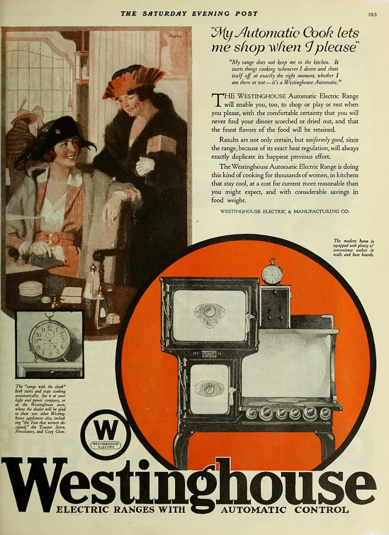
Photo: Internet Archive Book Images, No restrictions, via Wikimedia Commons
You've felt it before. You land on a website, and within about thirty seconds, something just clicks. The layout feels intuitive, the products seem curated with you in mind, and even the little error message when you mistype your zip code feels somehow... friendly? You end up spending way more time — and money — than you planned.
Then there's the other kind of site. Everything technically works. The checkout is functional. The prices are fine. But something feels off, like you're a guest who wasn't quite expected. You grab what you need and leave without looking back.
What's actually going on here? Turns out, a whole lot.
First Impressions Happen in Milliseconds
Research in UX design consistently shows that users form a gut reaction to a website in under 50 milliseconds. That's faster than a single blink. Before you've read a single product description or checked a price, your brain has already filed the site under "worth my time" or "get me out of here."
Visual hierarchy plays a huge role. When colors feel cohesive, when fonts aren't fighting each other for attention, and when images load cleanly without that awkward half-second blur — your nervous system relaxes. You're not working to understand the space; you're just in it.
UX designers call this concept "cognitive fluency," and it's basically the digital version of walking into a well-organized room versus one where the furniture is blocking the door. Ease of movement, even on a screen, signals safety and trust.
The Personality Problem Most Stores Get Wrong
Here's where things get interesting. A lot of online retailers — especially the big all-in-one platforms trying to sell everything from blenders to beach chairs — make the mistake of prioritizing inventory breadth over identity. They figure: more stuff equals more customers. But what they end up with is a storefront that feels like no one actually lives there.
The stores that build real loyalty? They have a personality. And no, that doesn't mean a quirky logo or a fun font. It means every touchpoint — the homepage banner, the product descriptions, the confirmation email, even the return policy language — sounds like it came from the same voice. A consistent, recognizable voice that makes you feel like you're dealing with actual humans who have opinions and taste.
Think about how differently you'd feel reading "Your order has been placed" versus "Nice — your stuff is on its way!" One is a transaction. The other is a relationship.
Curation Is Care
There's a reason people talk about their favorite stores the way they talk about their favorite playlists. Both involve someone making choices for you, and when those choices feel aligned with who you are, it feels personal.
Product curation is one of the most underrated trust signals in e-commerce. When a site shows you a "You might also like" section that actually makes sense, you feel seen. When the homepage features a seasonal collection that matches what you're already thinking about, you start to wonder if the store somehow knows you.
That sense of being understood is deeply emotional, not just practical. It's the difference between a store that seems to carry everything and a store that seems to carry your everything. The latter is way harder to quit.
Customer Service Tone: The Make-or-Break Nobody Talks About Enough
Let's be honest — most people only contact customer service when something goes wrong. Which means the tone of those interactions carries enormous weight. A robotic, defensive response to a simple shipping question can undo months of good vibes. A warm, no-fuss resolution to the same issue? That's the kind of thing people text their friends about.
Psychologists who study consumer behavior note that negative experiences activate stronger emotional responses than positive ones — a concept called "negativity bias." In plain terms: one bad customer service interaction can outweigh ten smooth transactions. Stores that understand this invest in service language that feels human, empathetic, and even a little bit funny when appropriate.
The best all-in-one platforms treat customer service not as damage control, but as brand expression. Every "we're so sorry about that" is a chance to either deepen or destroy the relationship.
Community Features: The New Loyalty Program
Points and punch cards used to be the gold standard for keeping customers coming back. But something has shifted. Shoppers — especially younger ones — are more interested in belonging to something than accumulating something.
This is why the smartest online retailers have started building community layers into their platforms. User reviews that feel like conversations. Style boards or wishlists you can share with friends. Brand newsletters that read like they're from a person, not a marketing department. Even comment sections and Q&A features under product listings create a sense of shared experience.
When you can see that 847 other people bought this exact candle and 600 of them left a note saying it smells exactly like a rainy Sunday, you're not just buying a candle. You're joining a tiny, informal club. That feeling of collective belonging is incredibly sticky.
Why "Merely Tolerated" Doesn't Cut It Anymore
Here's the honest truth about the current e-commerce landscape: there are too many options. Whatever you're looking for, there are probably fifteen sites that carry it. So the stores that win aren't necessarily the ones with the lowest prices or the fastest shipping — though those matter. The ones that win are the ones that make you feel something.
Feelings drive decisions. Not spreadsheets. Not comparison charts. The store that makes you feel welcomed, understood, and a little bit excited is the one that gets your business — and your word-of-mouth recommendation, which is still the most powerful marketing tool in existence.
At ShopVibe, we think a lot about this. The whole premise of an all-in-one shopping experience only works if the "one" part feels worth committing to. If it feels like a chore, you'll keep playing the field. But if it feels like home? You'll stop looking.
The Takeaway
The next time you notice yourself lingering on a shopping site longer than you meant to, pay attention to why. Is it the layout? The copy? The way the product photos are styled? Chances are, it's a combination of a hundred small decisions that add up to one big feeling: I belong here.
And that feeling? It's not accidental. It's designed. The best stores in the game know exactly what they're doing — and now, so do you.