Why Shopping Online Feels Electric on Some Sites and Completely Draining on Others

Photo: Internet Archive Book Images, No restrictions, via Wikimedia Commons
You've been there. You open one online store and suddenly you're in a groove — clicking around, tossing things in your cart, feeling weirdly good about the whole experience. Then you open a different site and within sixty seconds you feel like you've been staring at a spreadsheet for three hours. You close the tab. You don't even know what you were looking for anymore.
Same internet. Same you. Completely different feelings.
So what's going on? Turns out, there's a whole lot of neuroscience, psychology, and design theory baked into those experiences — and the best online retailers are using it deliberately. The worst ones are accidentally working against you. Let's break it down.
Your Brain Has a Reward System, and Stores Are Tapping Into It
Here's the short version: your brain runs on dopamine. It's the chemical that fires when something feels rewarding — finding a great deal, discovering something you didn't know you needed, or even just the satisfying click of adding something to your cart. Dopamine isn't just about pleasure after the fact; it actually spikes in anticipation of a reward. That's why browsing can feel exciting even before you buy anything.
Some online stores are designed — whether intentionally or not — to trigger that anticipatory excitement over and over. Others kill it almost immediately. The difference usually comes down to a handful of design choices that your conscious brain barely registers but your nervous system absolutely notices.
The Visual Hierarchy Effect: Where Your Eyes Go First
Visual hierarchy is basically the order in which your eyes move through a page. A well-designed storefront guides you naturally — big image here, price there, button right where your thumb wants to land. When it works, you don't notice it at all. You just feel like the site is easy.
When it fails, you feel lost. Your eyes bounce around looking for an anchor point. You're burning mental energy just trying to figure out what to look at. That cognitive load — the technical term for the mental effort required to process information — is exhausting in a way that's hard to name but very easy to feel.
Think about the difference between walking into a well-organized store at the mall versus one where the racks are crammed together and nothing is labeled. Same products, wildly different experiences. Online shopping works the same way, except the "racks" are pixels and the "labels" are font sizes and color contrast.
Color Is Doing More Than You Think
Retailers have known for decades that color affects mood. What's newer is how specifically that applies to e-commerce and how quickly it works. Research suggests people form a color-based impression of a website in under 90 seconds. That's not enough time to read a single sentence.
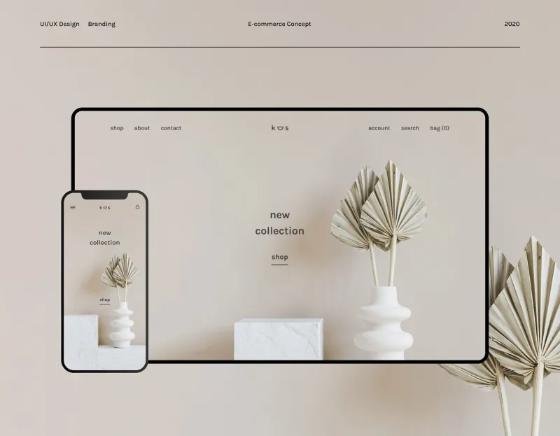
Warm colors — reds, oranges, yellows — tend to create urgency and excitement. That's why you see them on sale banners and countdown timers. Cool colors like blues and greens signal calm and trustworthiness. Neutrals — whites, grays, soft beiges — create a sense of space and focus, which is why luxury brands use them so heavily.
The problem is when a site mixes these signals without intention. A chaotic color palette sends your brain mixed emotional messages. You feel vaguely unsettled and can't explain why. You just know you don't want to stick around.
A store with a clear, consistent color story? It feels like it knows itself. And that confidence is contagious.
Micro-Interactions: The Tiny Moments That Add Up
Here's one that most shoppers never consciously notice but always feel: micro-interactions. These are the small animations and responses that happen when you hover over a product, add something to your cart, or scroll through a page. A product image that subtly zooms in. A cart icon that bounces when you add an item. A button that changes color when you hover.
These tiny moments of feedback are actually doing serious neurological work. They confirm that your action was registered. They make the interface feel alive rather than static. And they trigger small, repeated dopamine hits — the digital equivalent of that satisfying click of a ballpoint pen.
Strip all of that away and you get a site that feels dead. Flat. Like you're filling out a government form instead of shopping. The experience becomes transactional in the worst sense — purely functional, zero joy.
The Overwhelm Trap: When More Becomes Less
There's a flip side to all of this, and it's a trap a lot of well-meaning stores fall into. More stimulation is not always better. More colors, more animations, more pop-ups, more banners — at some point, the brain stops being excited and starts being overwhelmed.
This is where a lot of all-in-one style stores struggle. The instinct is to show everything at once — every category, every deal, every new arrival — because more options should mean more appeal, right? But what actually happens is decision fatigue sets in fast. Your dopamine system, which runs on anticipation, gets flooded and shuts down. Instead of feeling excited, you feel paralyzed. Instead of buying more, you buy nothing.
The stores that get this right use restraint strategically. They curate what's visible. They give your eyes places to rest. They make the journey feel manageable rather than endless.
What Forward-Thinking Stores Are Actually Doing Differently
The retailers who are nailing the emotional side of UX design right now aren't just chasing conversions. They're thinking about something called emotional resonance — basically, how does this experience make someone feel, and does that feeling match what we want our brand to represent?
That means testing not just click-through rates but actual shopper mood. It means investing in load speed because a slow page creates anxiety. It means making sure the checkout process feels like a satisfying conclusion rather than an obstacle course.
It also means being honest about what kind of store you are. A site that tries to be everything to everyone — no clear vibe, no consistent aesthetic, no obvious identity — creates a specific kind of low-grade stress in shoppers. You can't relax into the experience because nothing tells you what to expect.
The best shopping experiences, online or off, feel like they were designed with you in mind. Even if you've never visited before.
The Bottom Line
When a store makes you feel good, it's not an accident and it's not magic. It's the result of deliberate decisions about color, layout, pacing, and feedback — all of it working together to keep your brain in that sweet spot between engaged and overwhelmed.
And when a site leaves you feeling drained? That's also a design choice, even if nobody made it on purpose.
Next time you notice yourself lingering on a site longer than you planned — or bailing faster than you expected — pay attention. Your brain is giving you a real-time review. And it's usually right.