Hooked on the Scroll: The Secret Science Behind Stores You Can't Stop Visiting

You open a tab to "just check" if something you looked at yesterday went on sale. Forty-five minutes later, you've got a full cart, three saved wishlists, and absolutely no memory of how you got there. Sound familiar?
This isn't a willpower problem. It's architecture. The shopping platforms you keep returning to — the ones that feel weirdly comfortable, almost like a habit — have been deliberately designed to sync with how your brain processes reward. And once you understand the mechanics, you'll never scroll the same way again.
The Brain's Checkout Line
Let's start with the basics. Dopamine, the neurotransmitter most people associate with pleasure, is actually more about anticipation than satisfaction. It spikes hardest when you're expecting a reward — not necessarily when you receive it. This is why slot machines are more compelling than a straight cash handout, and why browsing a well-designed storefront can feel more exciting than the package that arrives three days later.
Behavioral psychologists have a name for this loop: variable reward reinforcement. The idea, originally identified by B.F. Skinner, is that unpredictable rewards generate more engagement than predictable ones. When you're not sure whether that flash sale is still running, or whether the product you've been eyeing dropped in price overnight, you're more likely to check. And check again. And maybe once more before bed.
Online retailers didn't stumble onto this accidentally. They've built entire engineering teams around it.
Personalization Isn't Kindness — It's Strategy
When a shopping site greets you with a homepage that feels like it was assembled specifically for you — your sizes, your style, your price range — that's not customer service. That's a carefully constructed feedback loop designed to reduce friction between your impulse and your checkout button.
UX designers often describe this as "reducing cognitive load." The less effort it takes to find something you like, the more likely you are to stay on the platform. But there's a psychological layer underneath that: when a site seems to understand you, it triggers something close to social bonding. You feel seen. And we tend to return to places — and people — that make us feel that way.
This is why recommendation engines have become so central to e-commerce. They're not just helpful tools; they're mirrors. A good algorithm doesn't just show you what you might buy — it reflects a version of yourself back at you, and that reflection is flattering by design.
The Notification Game
Push notifications are the digital equivalent of someone tapping you on the shoulder and whispering, "Hey, remember that thing you wanted?"
The timing and phrasing of these nudges is studied obsessively by retail platforms. Research in consumer behavior consistently shows that notifications referencing scarcity ("Only 2 left!") or social proof ("47 people are looking at this right now") create urgency that bypasses rational decision-making. Your prefrontal cortex — the part of your brain responsible for long-term thinking — gets sidelined by your limbic system, which is just trying to make sure you don't miss out.
FOMO isn't a personality flaw. It's a feature that certain platforms have learned to activate on demand.
Why Some Sites Feel Like a Chore
Flip the coin over, and the picture gets just as interesting. We've all visited stores that felt like navigating a bureaucracy — confusing layouts, irrelevant product suggestions, checkout flows that seem designed to test your patience. These aren't just bad experiences. They're dopamine deserts.
When the effort required to find something exceeds the anticipated reward, your brain quietly files that platform under "not worth it." You might return once or twice out of necessity, but you won't browse. You won't linger. And you definitely won't come back just to see what's new.
The difference between a site that feels like a destination and one that feels like a detour often comes down to a handful of micro-decisions: how quickly pages load, how intuitively categories are organized, whether the search function actually understands what you're looking for. None of these feel glamorous in isolation. Together, they determine whether your brain classifies a site as a reward or a chore.
The "Familiar Stranger" Effect
Here's something counterintuitive: you don't actually need to know a brand well for it to feel familiar. Repeated exposure — even passive exposure, like seeing a store's name in your browser history or catching an ad while scrolling — creates what psychologists call the "mere exposure effect." The more you've encountered something, the more positively you tend to feel about it, often without consciously registering why.
This is part of why a well-designed general storefront — one that seems to carry everything without being particularly loud about any single category — can develop a kind of ambient loyalty. It becomes part of your routine not because you made a deliberate choice, but because your brain started treating it as a known quantity. Safe. Comfortable. Worth checking.
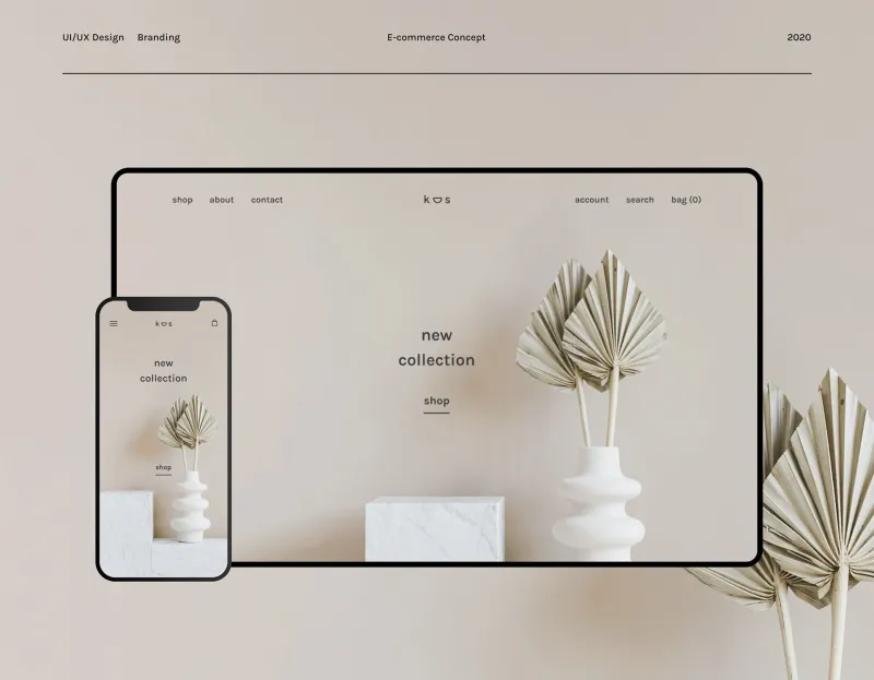
Shops that lean into this dynamic often do so through consistent visual identity, predictable navigation, and a homepage that always has something new without ever feeling chaotic. It's the retail equivalent of your favorite coffee shop rearranging the art on the walls — familiar enough to be comforting, fresh enough to keep you curious.
What This Means for How You Shop
None of this is meant to make you paranoid about your browsing habits. Understanding the psychology behind why certain platforms feel magnetic is genuinely useful — it helps you shop with a little more intention and a little less autopilot.
But it's also worth appreciating the craft involved. The best shopping experiences aren't accidental. They're the result of teams of designers, researchers, and data scientists working to create something that genuinely feels good to use. When it works, it doesn't feel like manipulation. It feels like the store just gets you.
And honestly? Sometimes that's exactly what you're looking for — a place that stocks everything you didn't know you needed, laid out in a way that makes the whole thing feel less like a transaction and more like a vibe.
That's the dopamine menu. And some stores have really figured out the recipe.