Mood Match: The Invisible Design Forces That Make You Stay — Or Slam the Tab Shut
You've done it a hundred times. You click into an online store, and within about four seconds, your whole body has already made a decision. Stay or go. Scroll or close. There's no conscious checklist running in your head — it's more like a feeling that washes over you, somewhere between instinct and taste. But here's the thing: that feeling isn't random. It's engineered. Sometimes brilliantly. Sometimes terribly.
At ShopVibe, we think a lot about what makes a digital storefront actually work — not just in a conversion-rate kind of way, but in a human, emotional, why-do-I-keep-coming-back kind of way. So let's break down the invisible forces that separate the stores you love from the ones you forget (or flee) immediately.
Color Is Doing More Work Than You Think
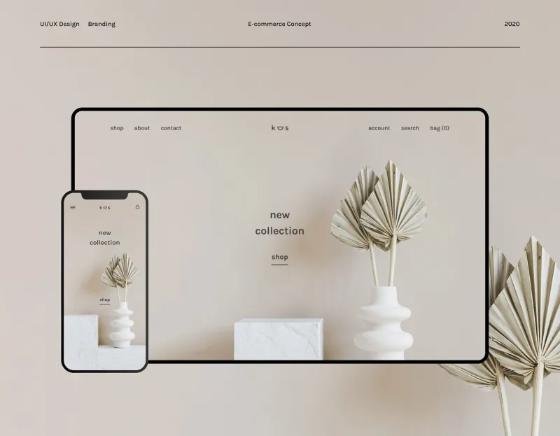
Before you read a single product description, color has already told you a story. Warm, earthy tones suggest approachability and comfort. Stark whites and cool grays whisper premium and minimal. Bright, saturated palettes scream fun and youthful energy. None of this is accidental on the stores that get it right.
The problem? A lot of generic storefronts throw colors together like they're decorating a college dorm with whatever was on clearance. Mismatched accent colors, backgrounds that clash with product images, call-to-action buttons that blend right into the page — these aren't just aesthetic sins. They're trust killers. Your brain reads visual inconsistency as a signal that something's off, even if you can't articulate exactly what.
A cohesive color palette doesn't need to be fancy. It just needs to be intentional. When every element on a page feels like it belongs to the same family, you relax. And relaxed shoppers? They spend more time, and usually more money.
Speed Is a Vibe (Seriously)
Here's one that people underestimate: loading speed is an emotional experience. A site that takes three-plus seconds to load doesn't just test your patience — it communicates something. It says, we didn't think your time was worth optimizing for. And once that thought enters your head, even subconsciously, you're already halfway out the door.
Fast-loading stores, on the other hand, create a sense of momentum. Everything feels snappy, responsive, alive. It matches the energy of actually wanting to shop. There's a reason major e-commerce platforms obsess over shaving milliseconds off their load times — because speed is part of the vibe, full stop.
The Way a Store Talks to You
Copy is wildly underrated as a vibe-setter. The micro-copy — those tiny bits of text on buttons, error messages, confirmation screens, and product descriptions — tells you everything about a store's personality.
Compare "Item added to cart" with "Nice pick! It's waiting for you in your cart 🛒." Both communicate the same information. But one of them makes you feel like a person, and the other makes you feel like a database entry. Over the course of a shopping session, those small moments of warmth (or coldness) accumulate into an overall emotional impression.
Generic storefronts often recycle boilerplate copy without thinking about tone. The result is a kind of personality void — a store that feels like it was assembled by someone who just needed it to technically function. Contrast that with shops where even the return policy is written like a human being drafted it, and you start to understand why some places feel like a conversation and others feel like a transaction.
Product Photography: The Difference Between Lust and Meh
Photography is probably the most visceral part of the vibe equation. Great product photography doesn't just show you what something looks like — it shows you what your life could look like with it in it. Lifestyle shots, consistent lighting, thoughtful angles, and cohesive editing all contribute to a visual language that either pulls you in or leaves you flat.
You've definitely seen the alternative: blurry images, inconsistent backgrounds, photos that look like they were taken in a garage with a phone from 2017. Even if the product itself is great, bad photography makes your brain file it under "sketchy" before you've had a chance to think twice.
The stores that nail their visual identity treat every image like it's part of a larger story. When you scroll through a well-curated product grid, it feels like flipping through a magazine you actually want to read — not digging through a box of unsorted stuff at a yard sale.
Micro-Interactions: The Details That Create Devotion
Okay, this one is a little nerdy, but stay with us. Micro-interactions are the tiny moments of feedback a site gives you as you use it — a button that changes color when you hover over it, a satisfying animation when you add something to your cart, a progress bar during checkout. Individually, they seem minor. Collectively, they create a sense that the store is alive and responsive — that it's paying attention to you.
When micro-interactions are missing or broken, shopping feels like yelling into a void. Did that click register? Is this page loading or frozen? Did my cart actually save? Anxiety creeps in, and anxious shoppers don't complete purchases.
The best online stores choreograph these moments carefully, so every interaction feels rewarding. It's the digital equivalent of a salesperson who makes eye contact, nods, and says "great choice" — small acknowledgments that add up to a feeling of being seen.
When Everything Clicks (Or Doesn't)
Here's the real magic trick: when all of these elements — color, speed, copy, photography, micro-interactions — are working together toward the same emotional goal, the result is something you can't quite put into words but immediately recognize. It's a vibe. A sense of coherence. A store that knows what it is and makes you feel something specific while you're in it.
Generic storefronts fail not because any one element is catastrophically bad, but because nothing is talking to anything else. The colors don't match the copy's tone. The photography doesn't match the price point. The speed doesn't match the promise of quality. Mixed signals, everywhere.
Shopping online should feel good. It should feel like somewhere you want to be, at least for a few minutes. And when a store figures out how to make that happen consistently? That's not just good design. That's loyalty, built one micro-moment at a time.
So next time you find yourself lingering on a site way longer than you planned — or bouncing off one in under five seconds — pay attention to what's actually happening around you. The vibe is talking. You're just finally listening.